NASA: 2023 HOTTEST YEAR ON RECORD
Hey, Space Placers!
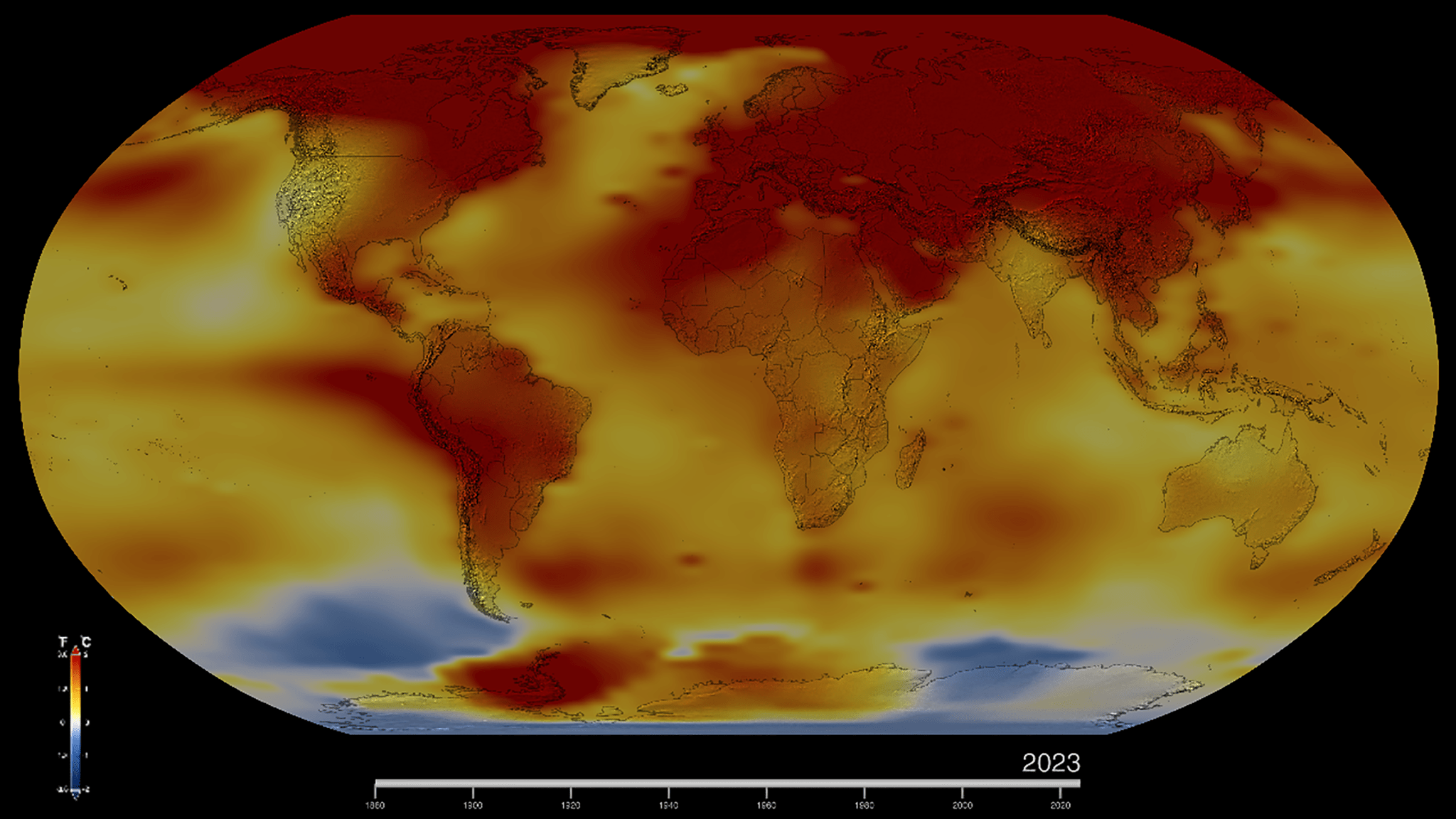
This map of Earth in 2023 shows global surface temperature anomalies, or how much warmer or cooler each region of the planet was compared to the average from 1951 to 1980. Normal temperatures are shown in white, higher-than-normal temperatures in red and orange, and lower-than-normal temperatures in blue. An animated version of this map shows global temperature anomalies changing over time, dating back to 1880. Download this visualization from NASA Goddard’s Scientific Visualization Studio: https://svsdev.gsfc.nasa.gov/5207.
NASA’s Scientific Visualization Studio
Check out the video below and the news release.
Climate change is here to stay and is going to cause ever worsening weather as the planet's temperature goes up. It's up to humanity to confront the causes of climate change and take the necessary steps to halt and reverse it.
Sky Guy in VA


Comments
Post a Comment